Iterations Ahead with Regroup 2.1.
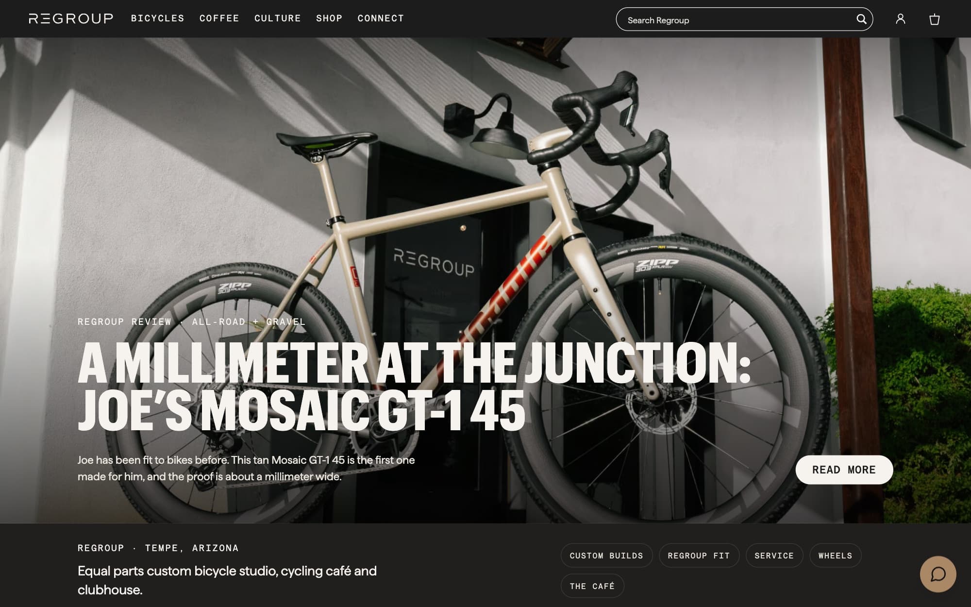
Just over two years ago we launched Regroup’s new site. A few weeks ago we took it upon ourselves to start what we called, internally, Regroup 2.1: the same design, but different.
Two years on.
We’re very lucky to have some truly excellent clients, who we work with and have worked with for months and years. 7mesh is one of those, one of our oldest, going back to 2018, when we used to live in Portland, Oregon. And more recently Regroup, in Arizona, who we’ve had the pleasure of working with for, well, now over two years.
It was just over two years ago that we launched their new site, designed and built on WooCommerce. They had WooCommerce originally. We wrote about that when we first did the work: why they wanted to keep it, some of the challenges that can come with that system, and the benefits too.
Regroup 2.1.
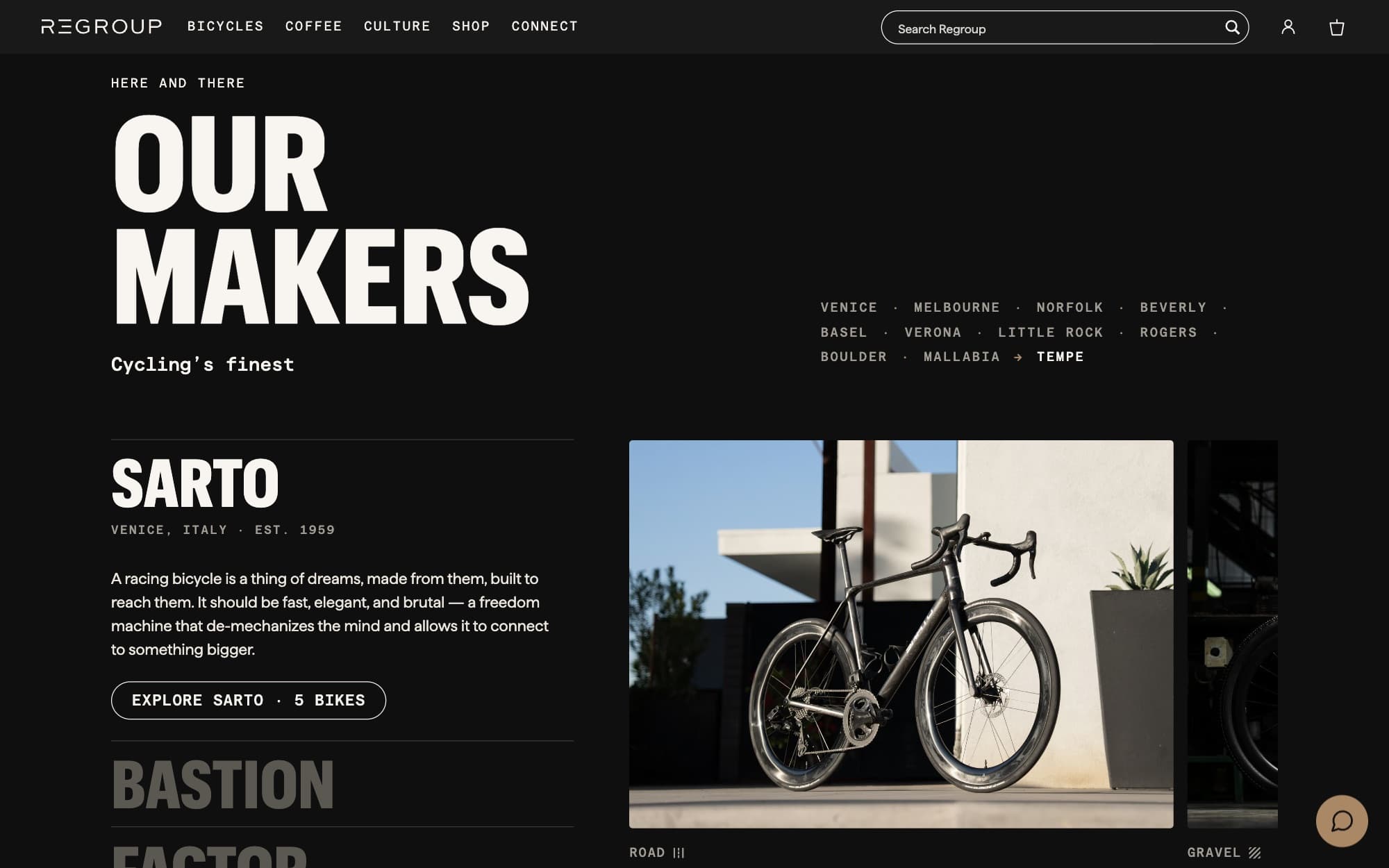
Of late, like anything after two years, we saw in our minds some iterations to the design, in concert with the way the business had been developing and growing. Some changes to how we could better communicate what it is now, two years later, and what it’s become: new areas of the business and refinements to existing ones, too.
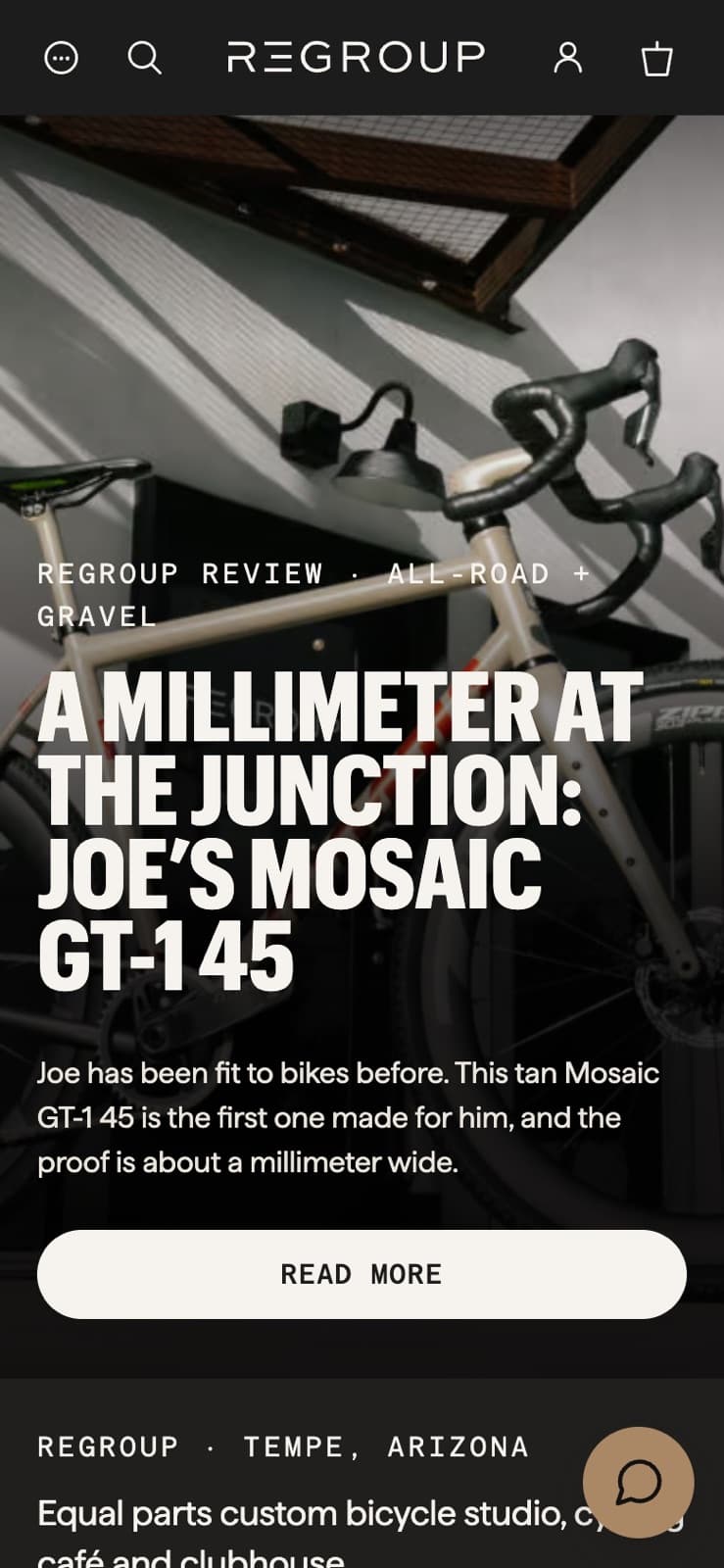
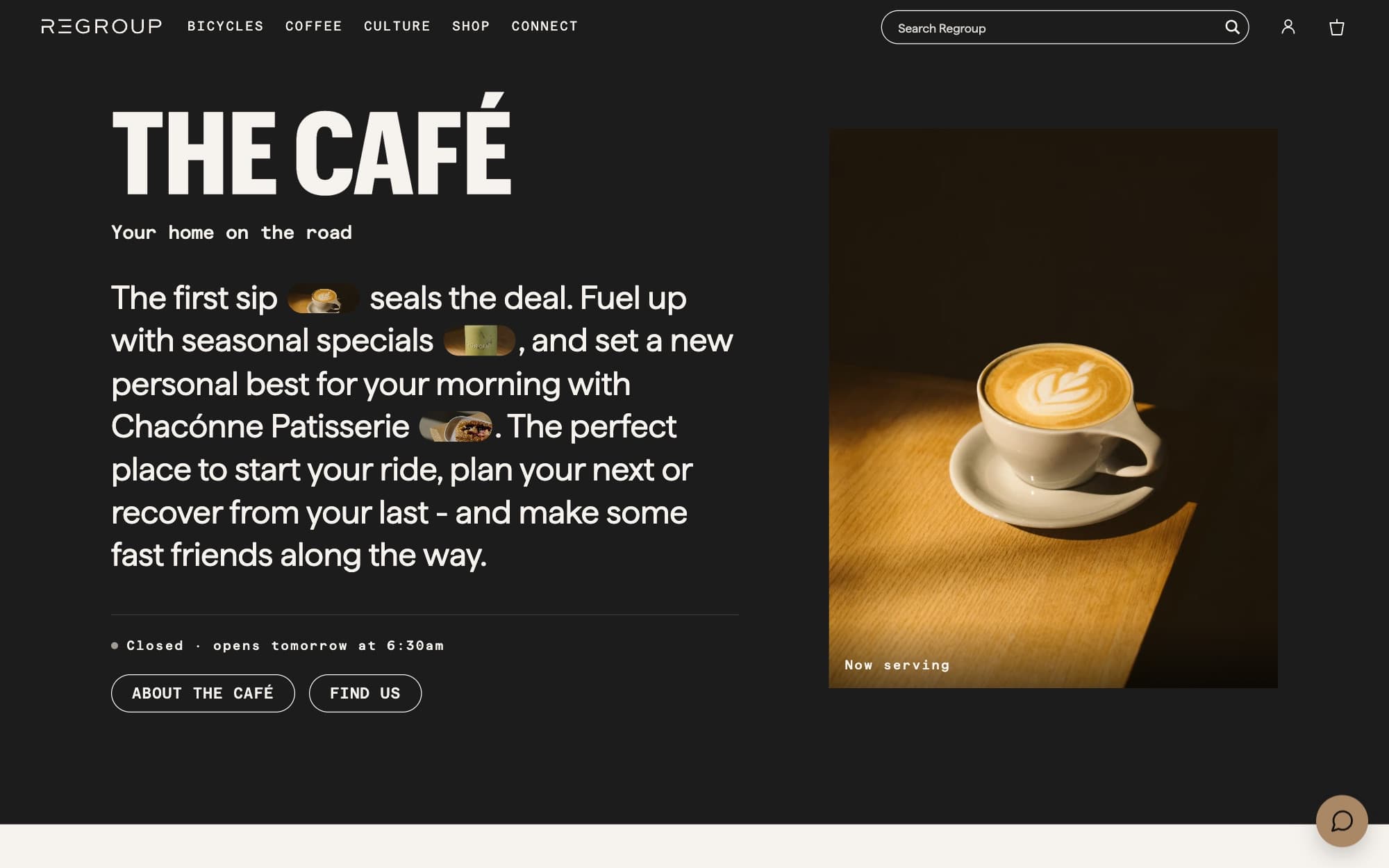
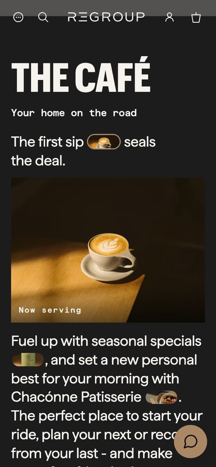
So a few weeks ago we took it upon ourselves to start what we called, internally, Regroup 2.1, and began designing and rolling out pages, from the homepage to the café page to the Visit page.
That work carries on. There are still a few pages we’d like to look at through a lens of same design, but different. Iteration is a good word for it.
Why now?
Well, since we did the work on the site, Regroup has gone from strength to strength.
We’re not going to be like some of the so-confident people we see on Instagram and other places, who are very quick to take any growth in a brand as a result of their own work. We know that we’re just one small cog in a bigger system. But nevertheless, we assuredly must have had an effect. We’ve received sentiment to that effect from the brand owner and the team, and from their customers.
So with things going the right way, and business going tens of percentages higher each year, we took that momentum — and a lot of positivity, as there always is with a brand you like working with and have done for a long time, which I guess is two ways of saying the same thing — and started developing this iterated, revised look.
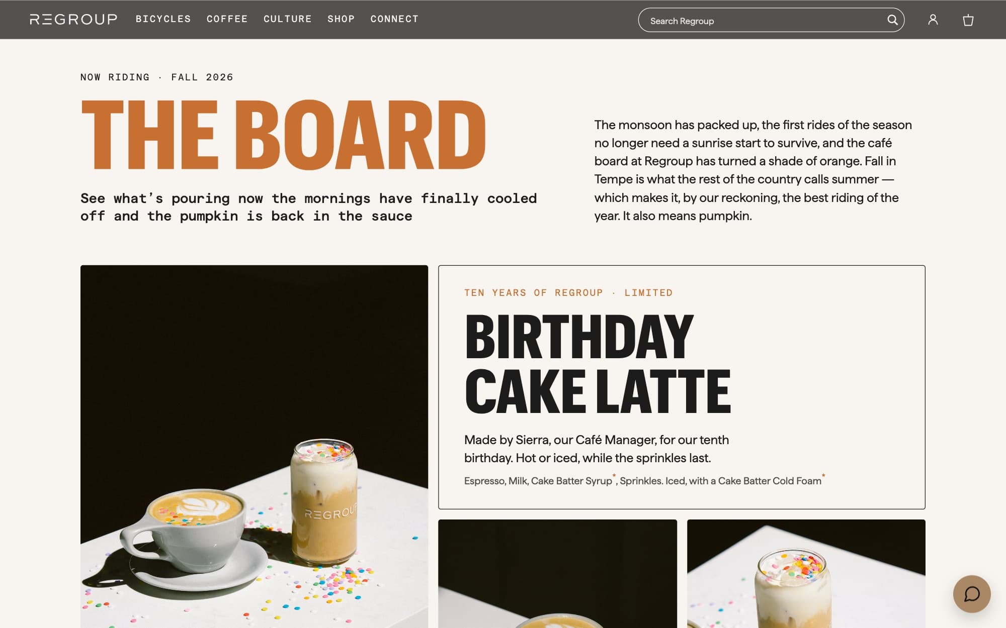
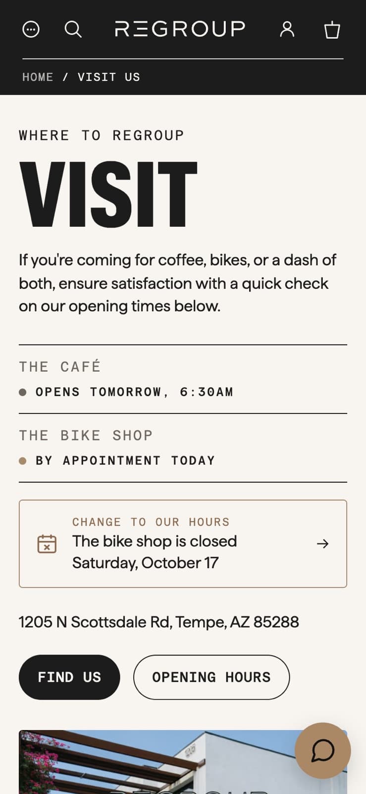
Into people’s eyeline, sooner.
That work included a focus on clarity, brevity, and getting things into people’s eyeline sooner.
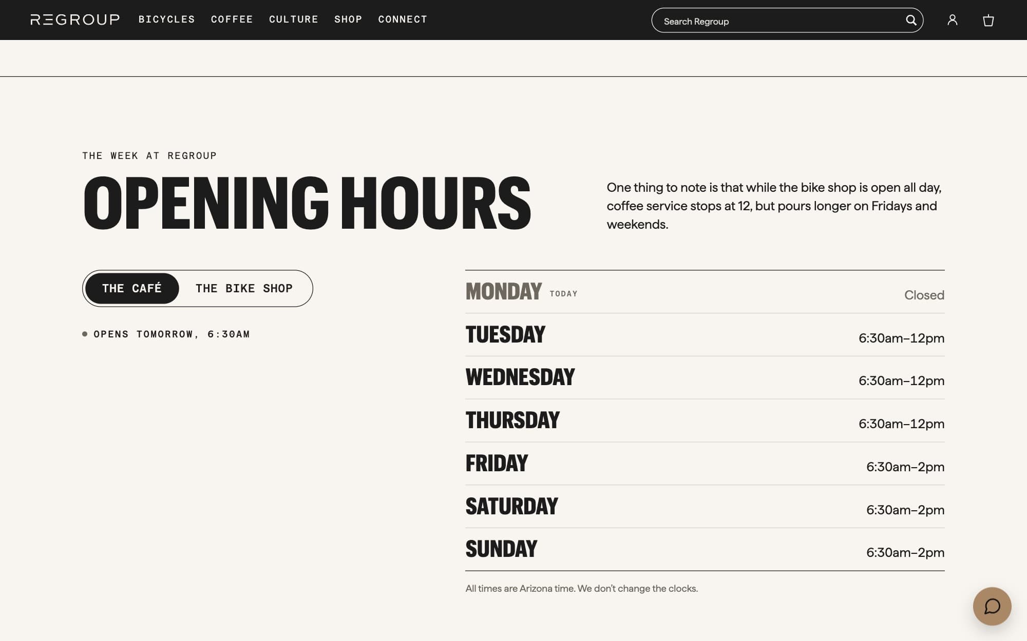
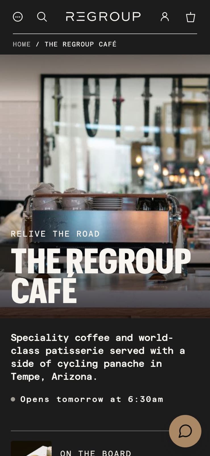
A page on its own is not that complicated.
A wider part was aligning the website with the brand’s aim of striking out with more e-commerce: more items to be sold on the site. That required thinking about categories — how they might be shown, how they might align with brand pages, how everything would work together.
It’s one of those areas where designing a page on its own is not that complicated. But when it’s part of a wider system, it has to be understandable, logical, enjoyable. People have to flow from one page to the other without getting lost, or meeting duplicated content, or an experience which drops them at some point. Everything has to be at the same high level, and has to talk to them in the same way, and has to make sense.
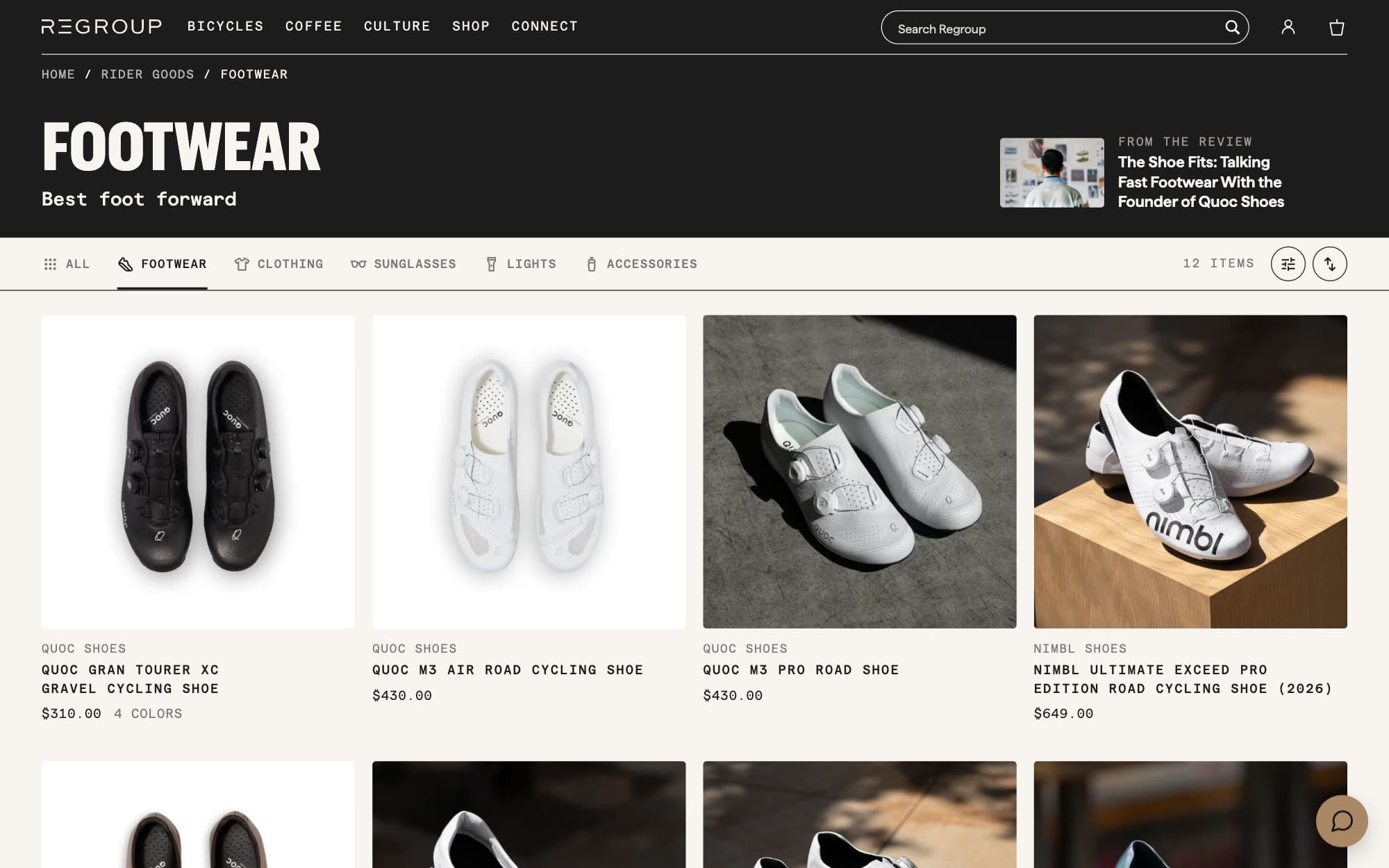
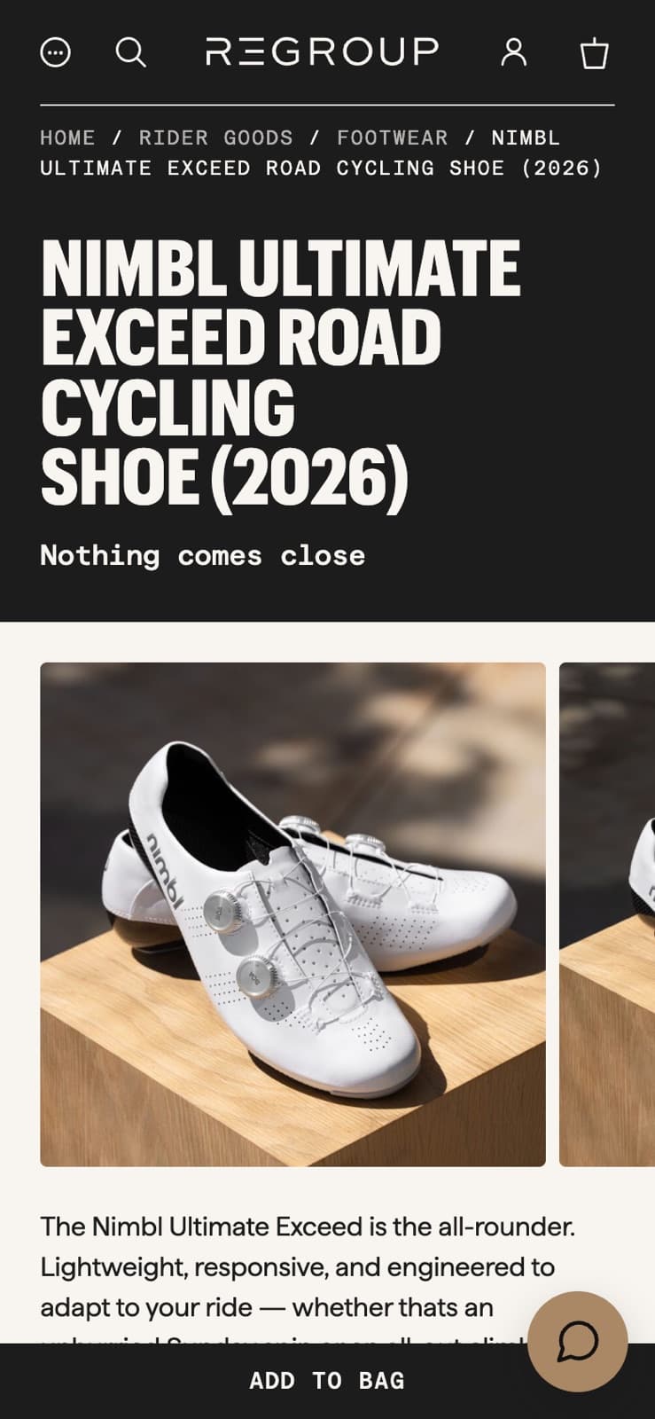
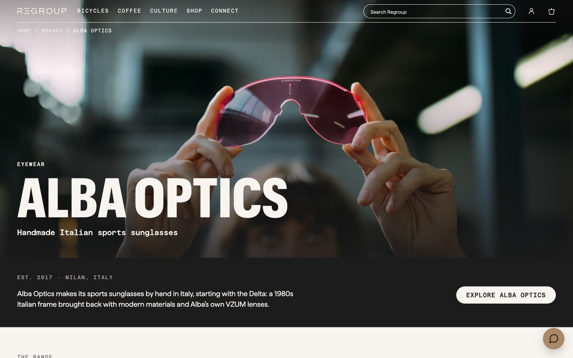
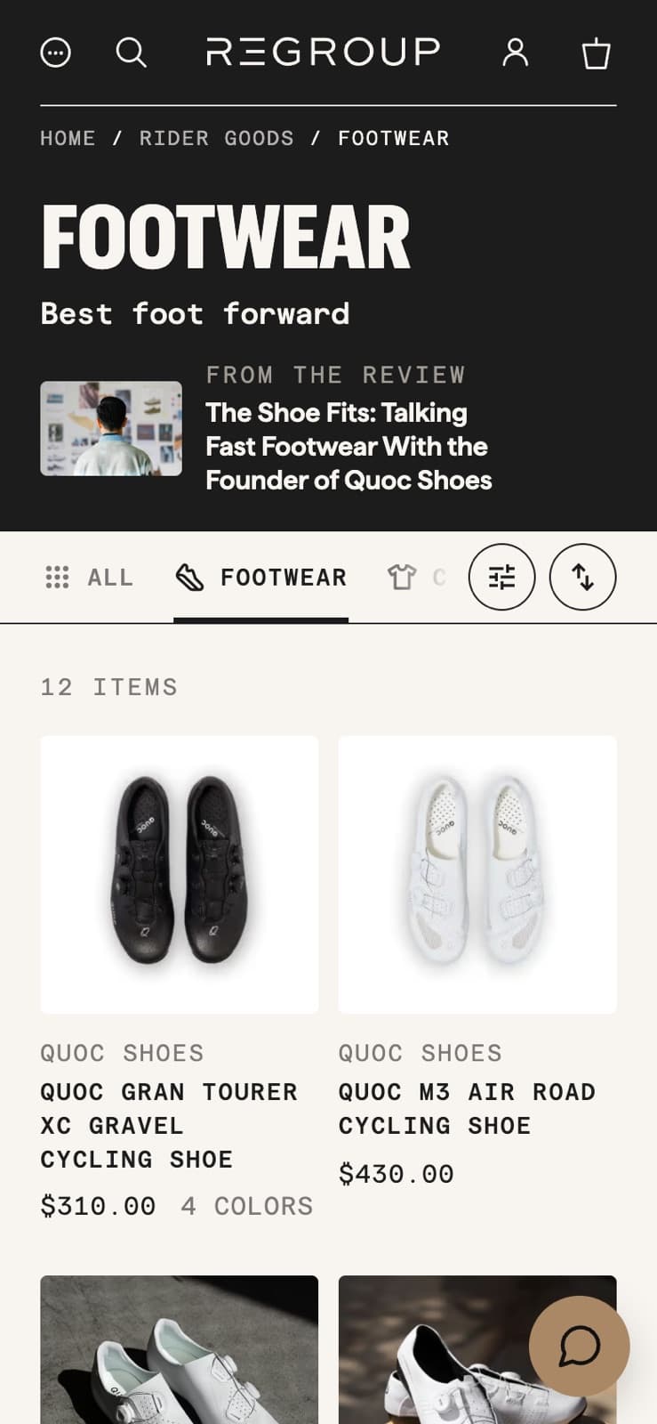
It becomes feel.
That’s one of the things I think you get better and better at as you work with a brand for longer. You have a deeper, really innate understanding of what needs to be done and what doesn’t. Almost without even having to think. It becomes feel.
And I guess that’s also backed up by e-commerce experience going back to 2008: of driving a site to work for its users, and to be a delight, and to have a little bit of a sense of playfulness too.
The next two years.
All of which is to say: visit regroupwithus.com and you’ll start to see the new version rolling out. We hope you enjoy it.
And we hope the next two years with Regroup are as fun as the last two.
- A new homepage, led by the latest build story
- New café, Visit and Bike Shop pages
- Categories and brand pages that work together, for more e-commerce
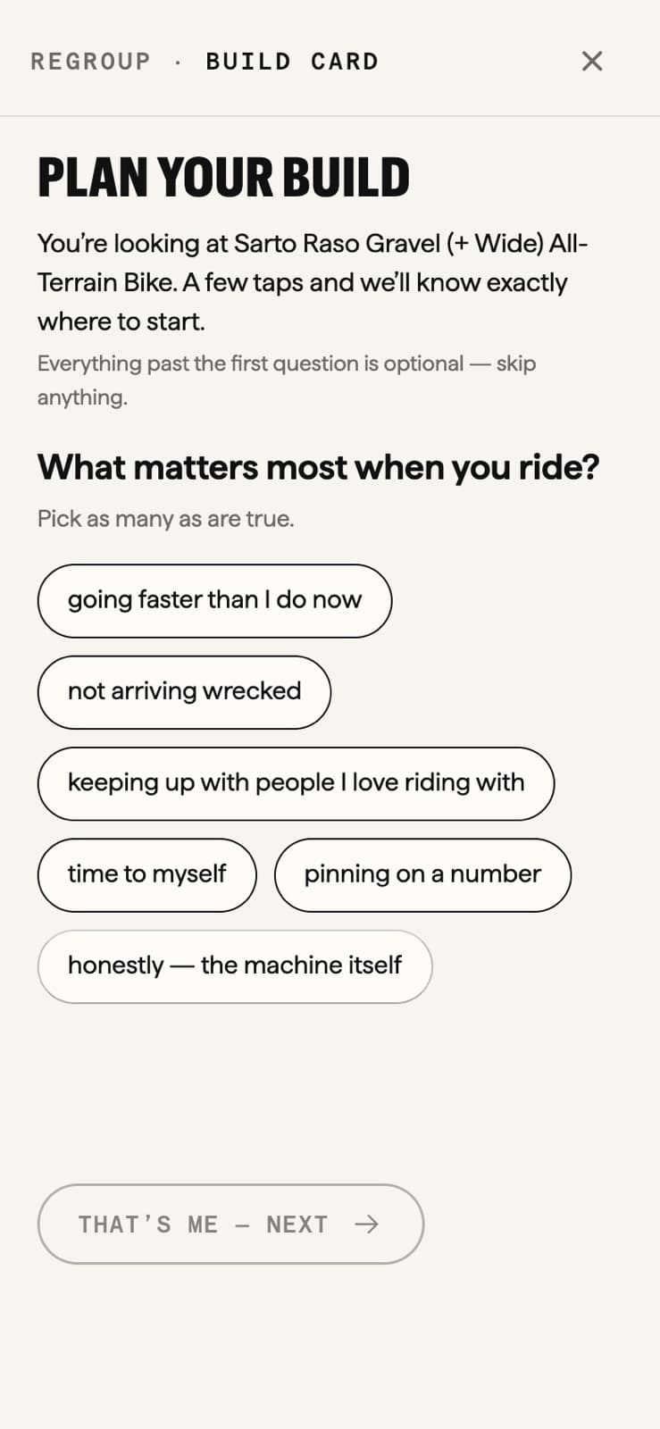
- New product pages, and custom bike pages with a build card for planning a build
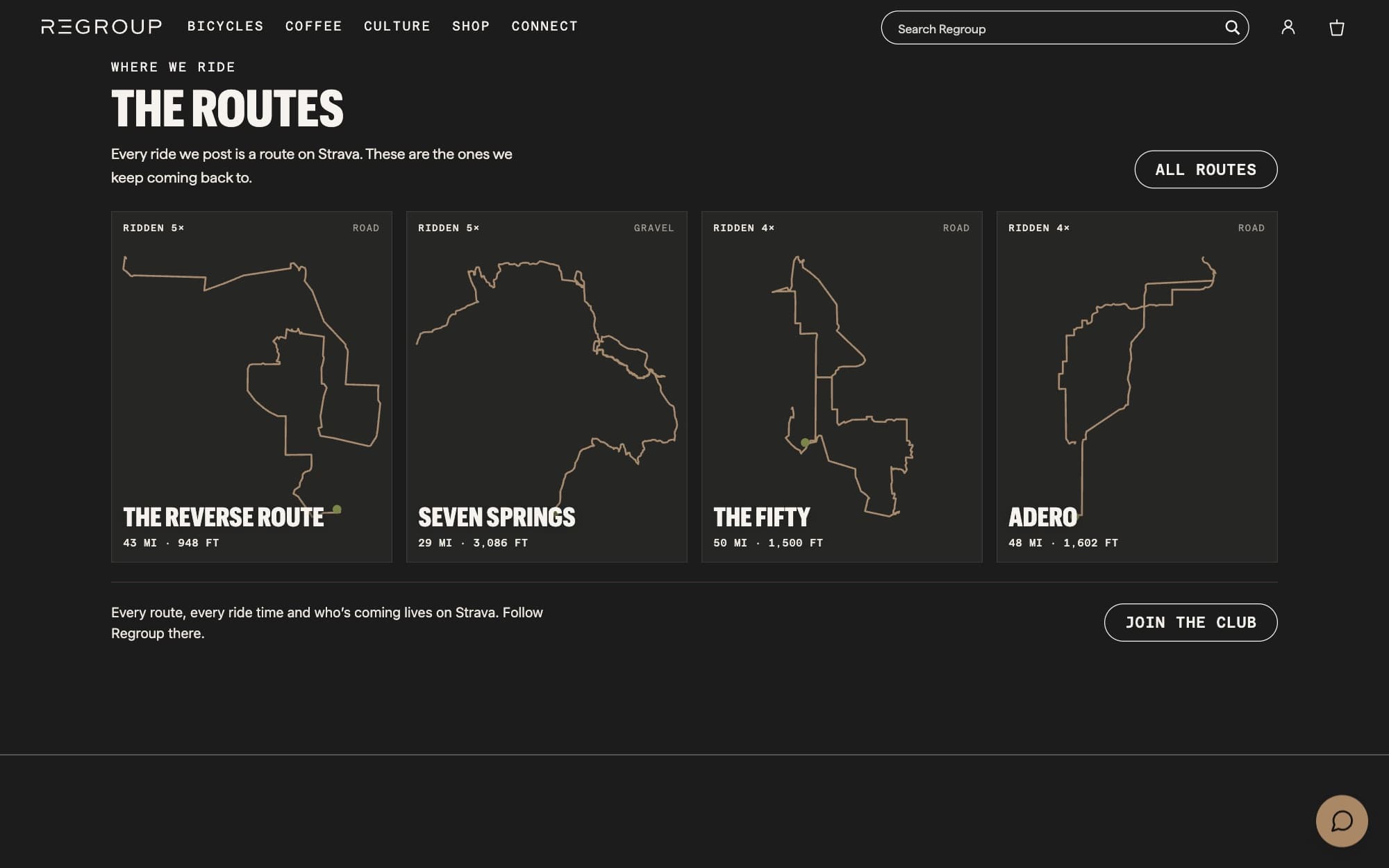
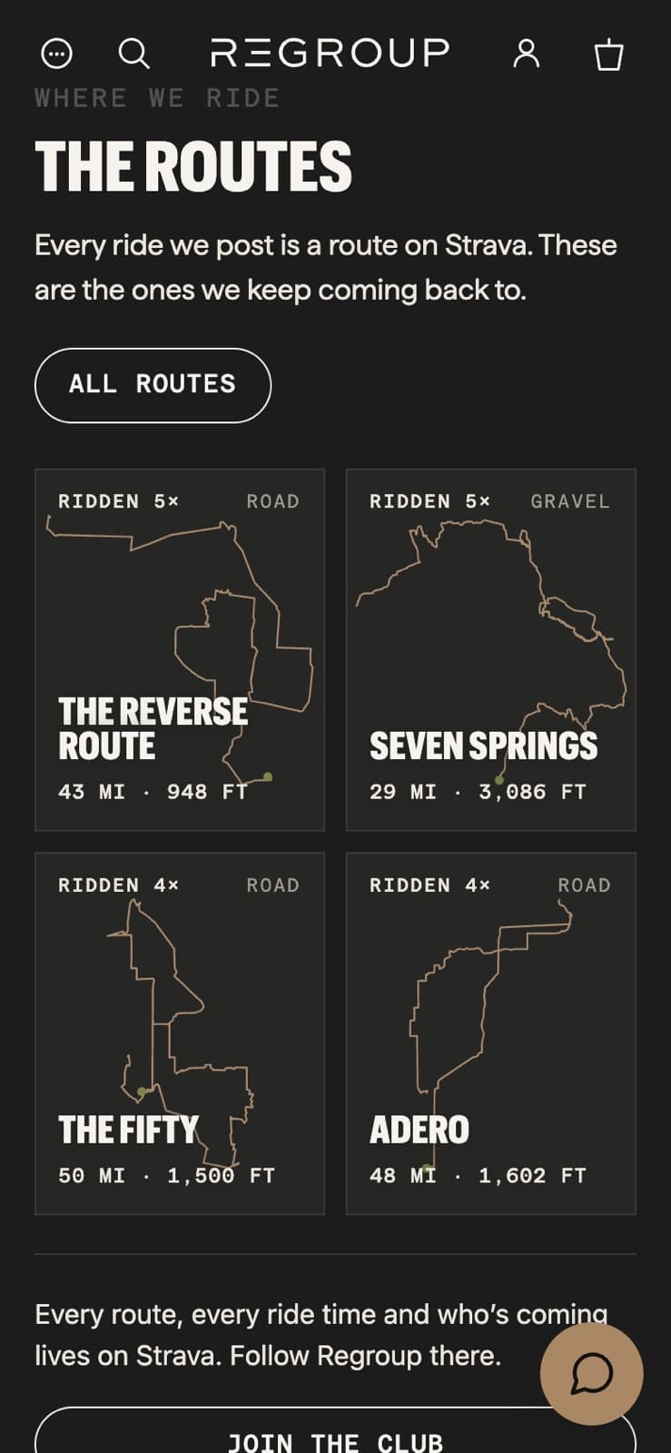
- A routes library drawn from the shop’s own rides
- A members’ club: join by email link, Apple or passkey